Launchpad 2.0
A new more powerful option for the Launchpad system
Written By Ed Kinne
Overview
Launchpad 2.0 is an optional enhancement to the Launchpad Template system.
It gives Launchpad users more flexibility with templates, including image sizing and text styling options.
It gives Launchpad creators a new Theme Builder tool that can give Launchpad users even more options when using Launchpad templates
Launchpad 2.0 is an optional enhancement to your Korbyt Tenant. It is a Tenant wide choice that can be tunred on by contacting the Korbyt Support Team Contacting Support
Video Review
You can also review this video of the material
Video controls will be in the lower right corner once the video starts
Chapter View
Toggles the Chapter list to be visible/invisible when the mouse is over the video window
Closed Captioning
Turns on Closed Captioning when available in the video
Full Screen View
Launchpad 2.0 Publishing
When you enable Launchpad 2.0 in your tenant, you will immediately see a change in how Launchpads are edited.
In Korbyt-provided templates and previously created custom templates, these new options will be present with no further action needed.
The new Theme Builder and Parameter Attribute will add more options for users when publishing through Launchpads. We review those later in this article.
Launchpad Editing Screen
In the Launchpad editing screen, all editable sections will be laid out on the right side
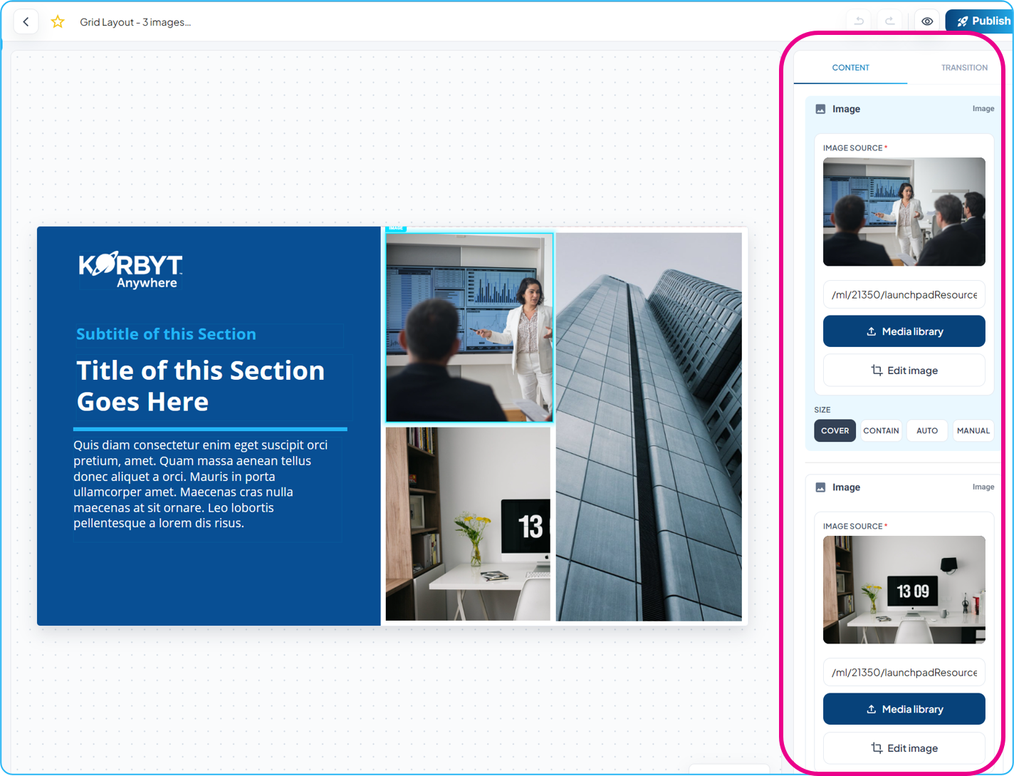
Each templated element is listed, showing its editing options
Image Elements new options
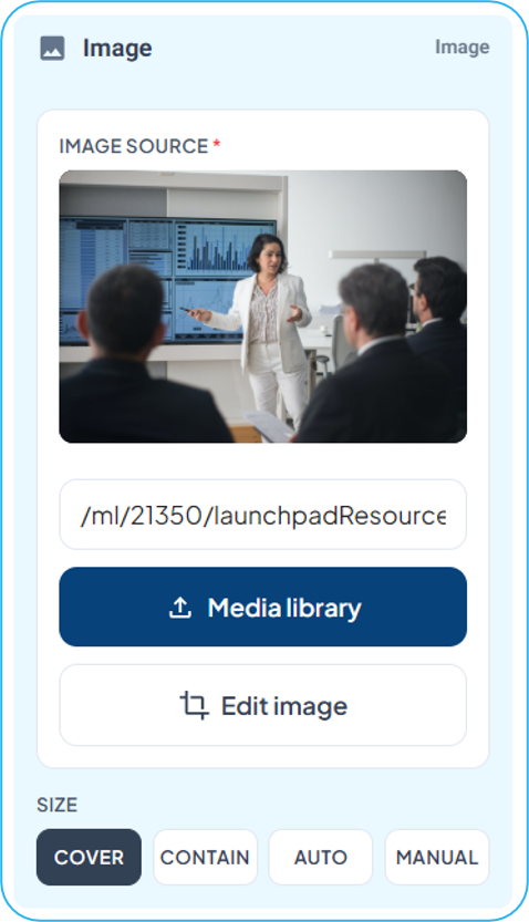
Media Library - The source of the image is still controlled by the predefined layout, but if uploading a new item is allowed, users have the ability to select the folder where the image is saved
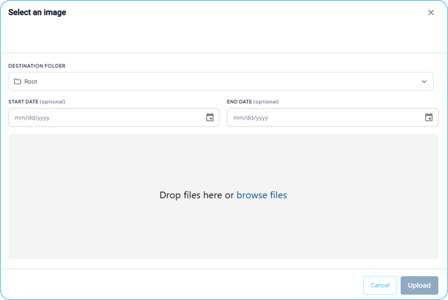
Validity Dates can be added to the asset, but will not affect them being shown in the design being created through the Launchpad
Folders available to the user to save an upload are controlled by User Group and Folder permissions - Folders & Groups to set Permissions and Access Controls
Edit Image - Users have the ability to reposition, zoom, and crop an image
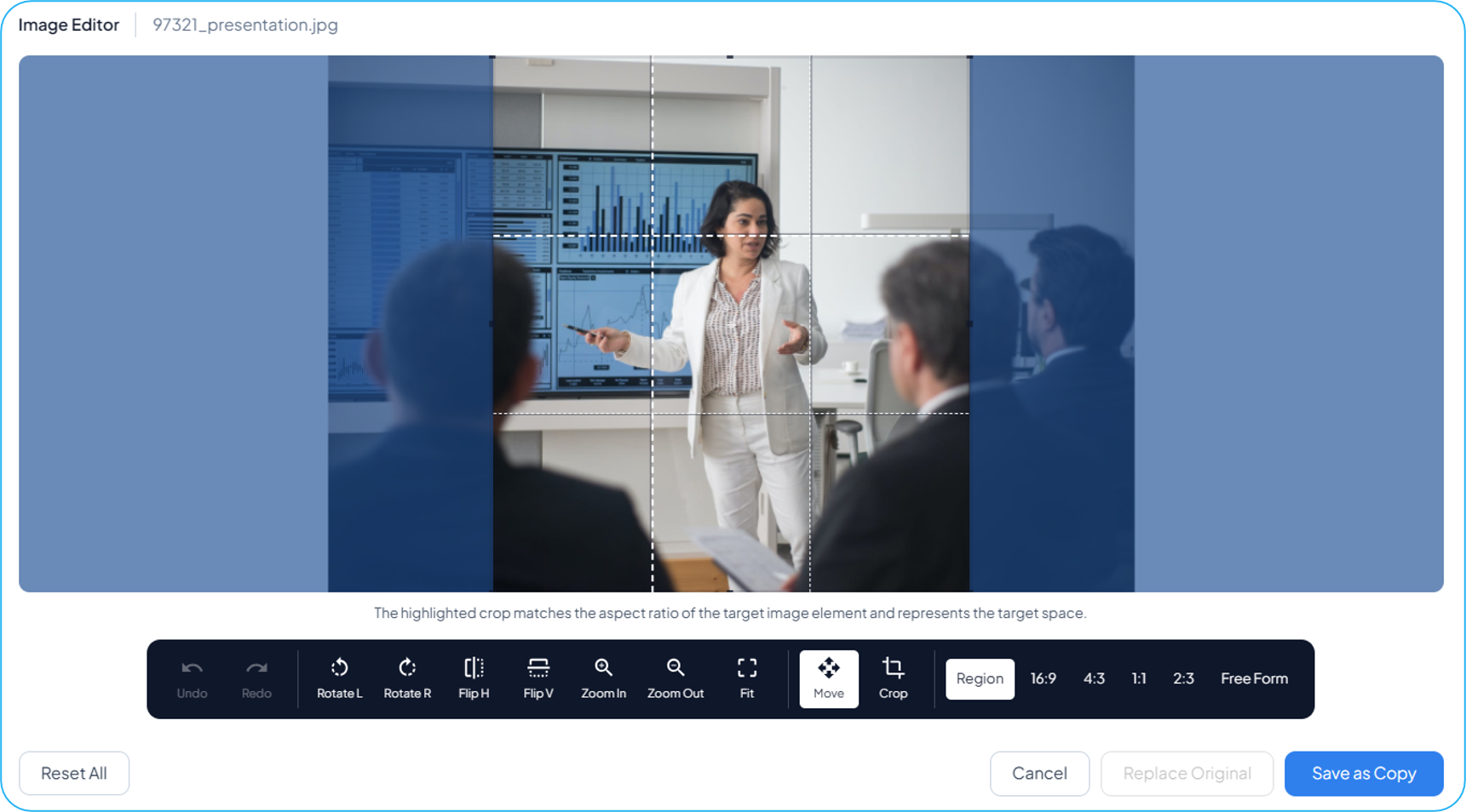
Size options - Users have the ability to now select the sizing behavior that is applied to the image
Text Element new options
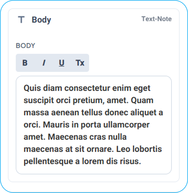
Users can now select to apply Bold, Italics, and/or Underlining to the text in the element. The 4th option clears all applied formatting
More Text options can be unlocked in custom templates by applying theme parameters to an element, reviewed further in this article.
A new Transition Tab is available at the top of the right-hand editing column
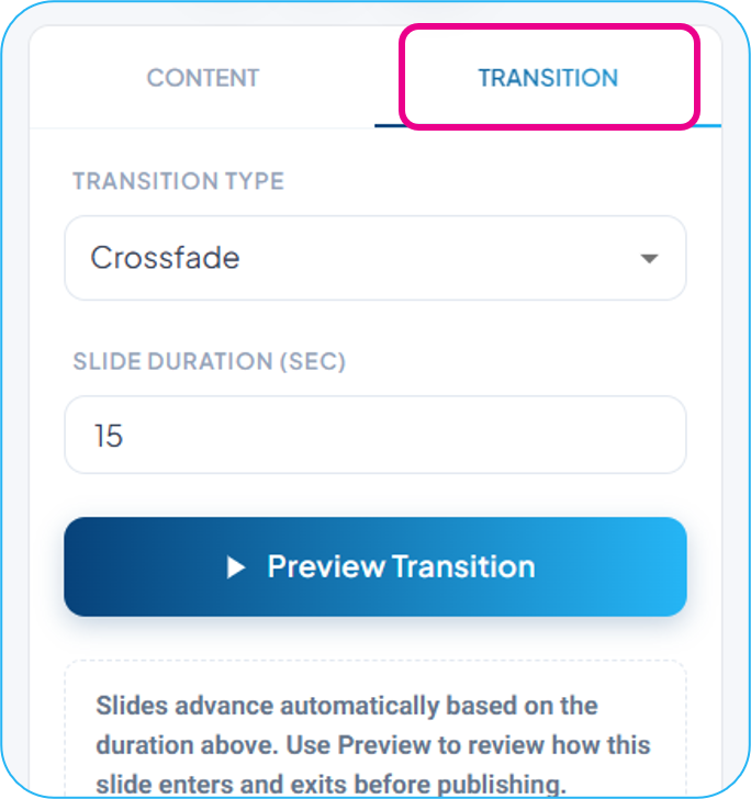
Transition animation the content uses
Duration of the item on screen
The Transition and Slide Duration settings will be applied when the user selects a Player, Player Group, or Playlist in the assignment options when publishing
If the content is being delivered to screen through a Tag Based Clever rule, the Clever rule will assign duration and transition
An Updated Publishing Tab
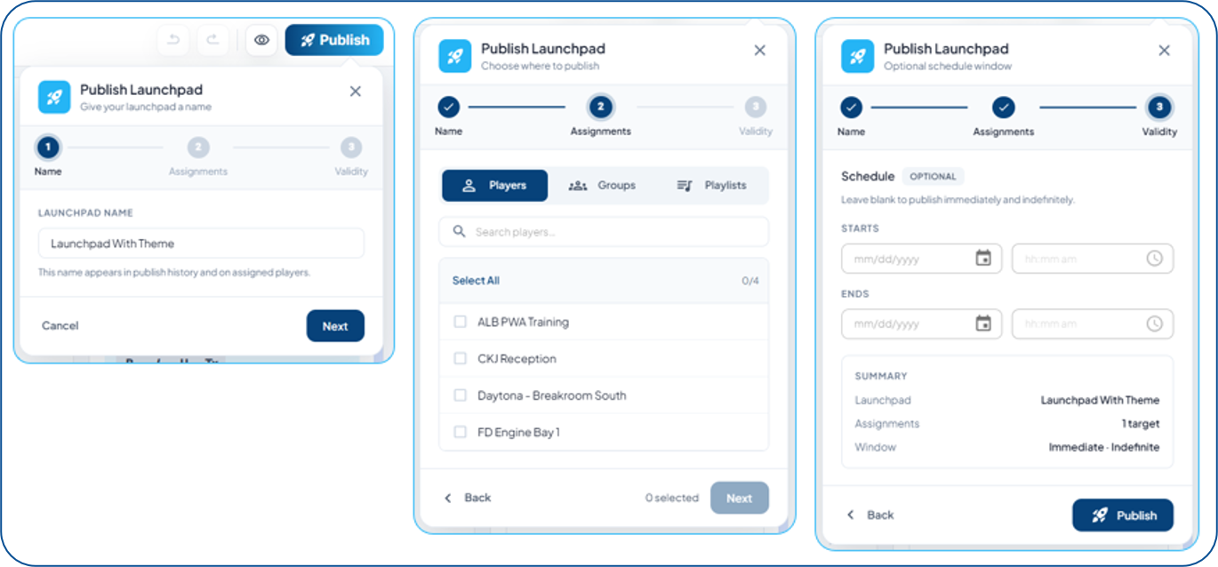
Publishing Options are now laid out with more visual space, making the options easier to navigate and assign
The options available are still controlled within the individual predefined layouts.
Theme Manager
The Theme Manager can be found in the Content section and provides enhanced configuration options for choices within Launchpad templates.
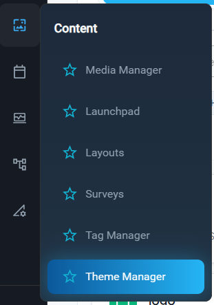
The Theme Manager has two sections
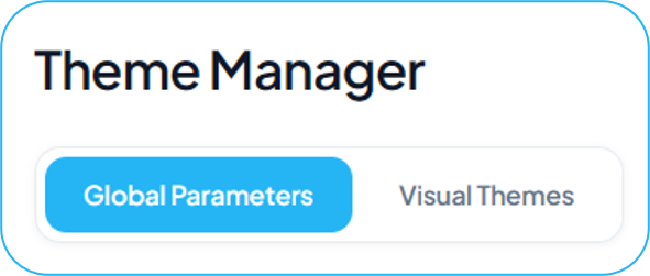
Global Parameters
These are the named variables for text, image, and color space values that you will define in the themes
Examples: Title Text, Body Text, Main Image, Logo Image
Visual Themes
These are the collection of parameters and their assigned values
Example: Title Text, set to a specific font, font color, and size options
You would be free to create a Dark Theme and a Light Theme, each with their own selections for background images, logo images, and font colors, and then you can switch between the two themes while only needing to design one predefined layout
Users will have the ability to switch between available Themes when they edit a Launchpad
When Launchpad 2.0 is turned on, your first Theme will be the Korbyt Brand Settings Theme, and will be heavily controlled by your brand settings in the CMS Branding Control and Settings for Signage
Themes will require a unique choice when configuring the Predefined Layout to make them available; see the Enabling Parameters in Predefined Layout Template section in this article for more details
Global Parameters
Global Parameters, in the Theme Manager, define Typography, Color, and Image space variables. They do not define the value of those variables, as those are set within the Visual theme.
Each tenant will start with the following default parameters that can not be deleted
Typography: Title, Subtitle, and Body
Colors: Primary, Secondary, Tertiary
Image: Logo and Logo Horizontal
You can create more Parameters, that can then be defined in the Visual Themes
To create a new Parameter:
On the Theme Manager page, click + Create Parameter
Enter the Parameter name
Select the Parameter type
If text-based, select whether there will be enabled size variants
In this example, I have created a new text parameter called “Footnote”
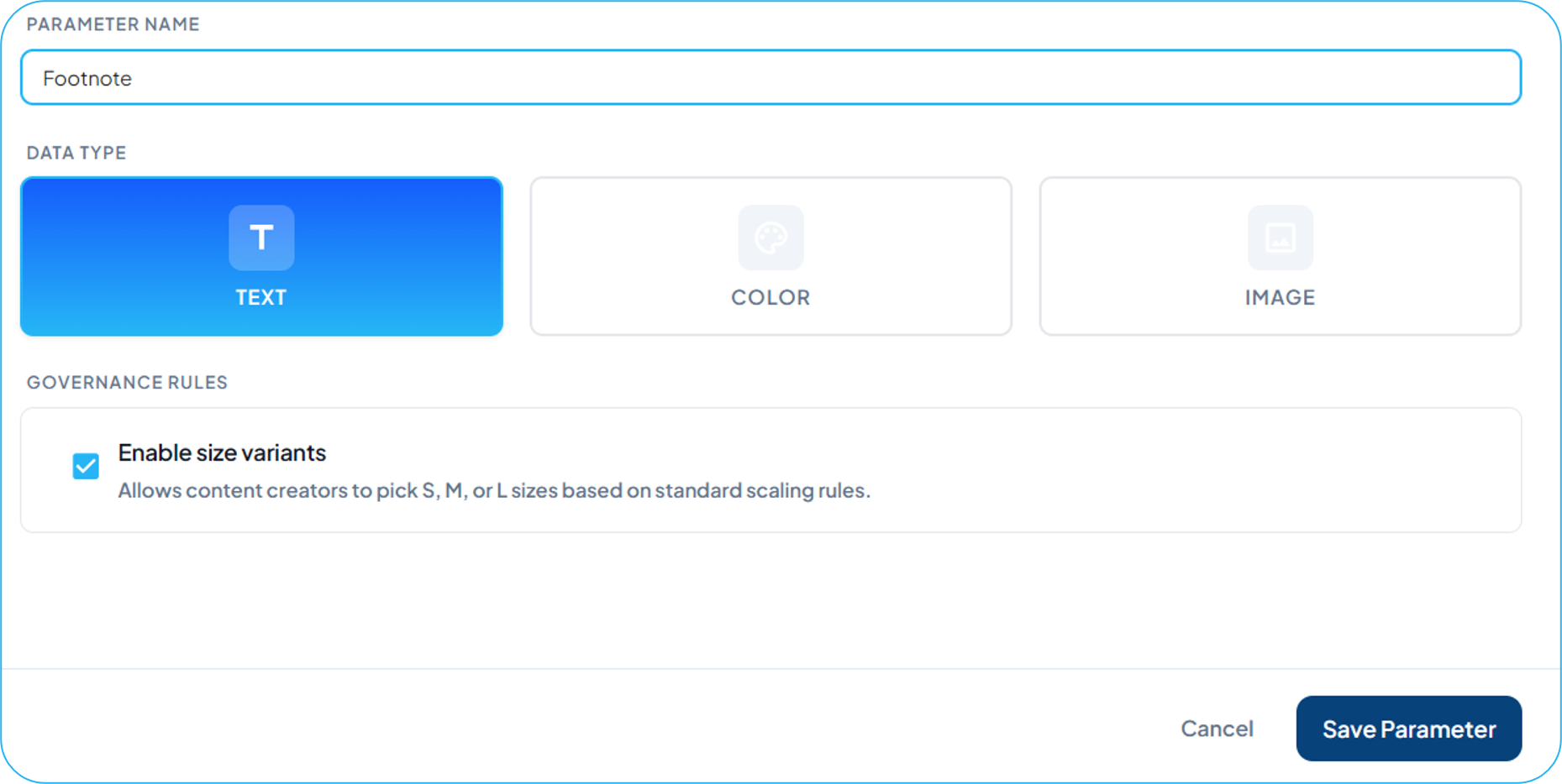
Click Save Parameter
It is now listed in my Global Parameters
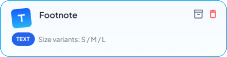
As a user-created parameter, it can be deleted and archived if it should be removed from Visual Themes
New Parameters are added as available in all Themes
Visual Themes
Themes provide a way for administrators to configure parameters in a group; then users can select a theme to give them access to those configured paramaters
For Themes to be available when editing a Launchpad, the Predefined Layout that is the template has to have an element that is set to Parameter, which is reviewed in the Predefined Layout Templated Elements section
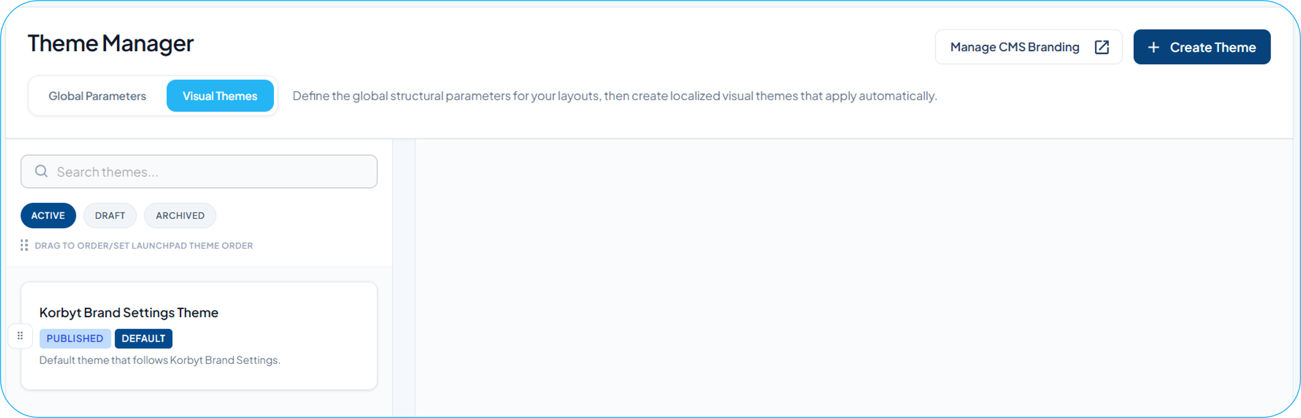
The Kobryt Brand Settings Theme is your first and default theme; it is initially based heavily on brand settings in the CMS Branding Control and Settings for Signage
You can create new themes from scratch by clicking the + Create Theme button in the upper right, or by cloning an existing theme and then editing it.
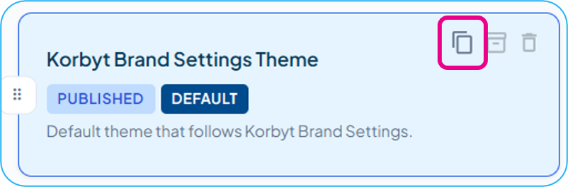
Editing a Visual Theme
Click + Create Theme, or click on an existing theme
This example will follow the process of creating a new theme
Configure the Parameters for the theme (Global Parameters and User-Created Parameters)
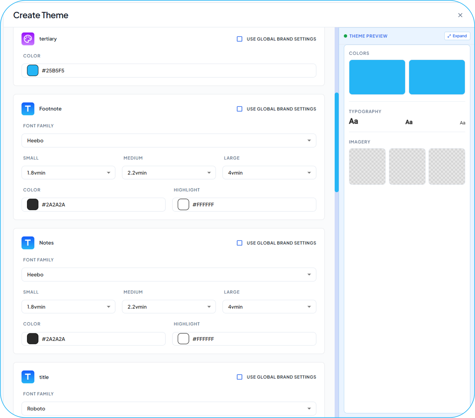
Each parameter will be listed down the center of the Visual Theme
Each text Parameter (Title, Body, etc.) has its own section
Text Parameters: Setting Font, size, and color options
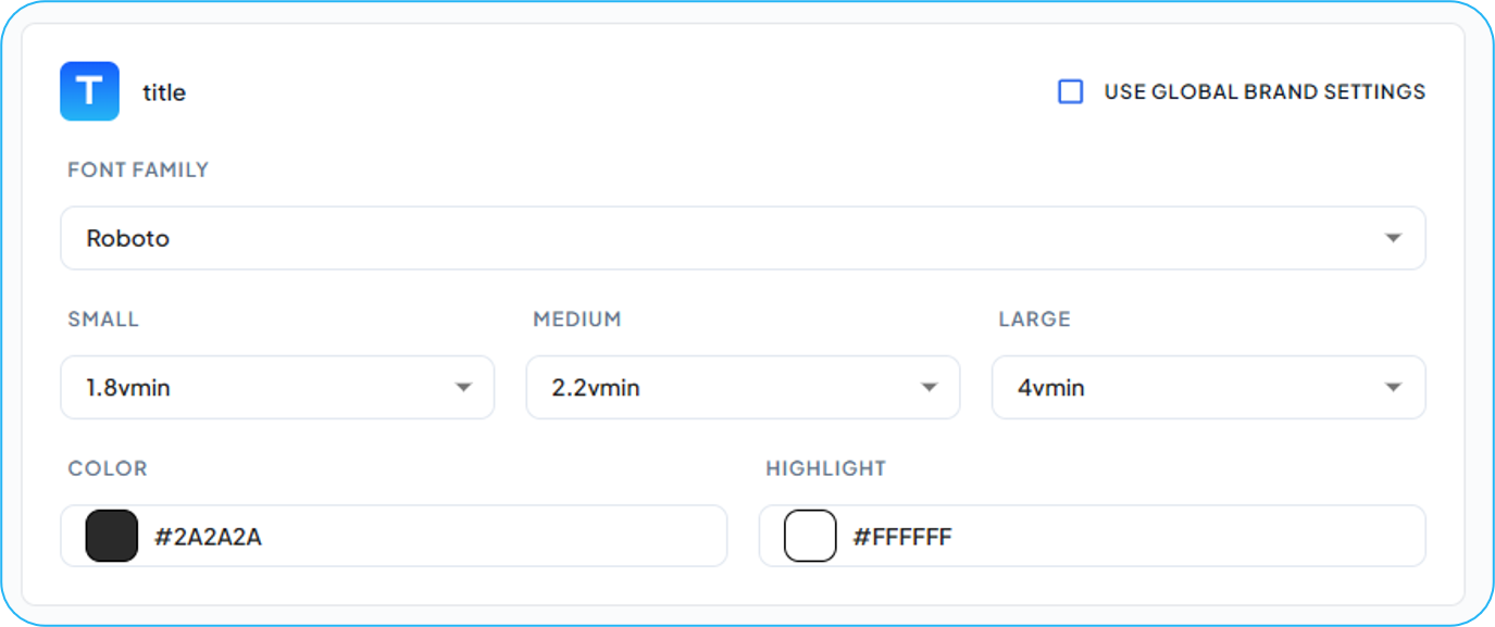
Parameter Name is in the top left
Use Global Brand Settings: When turned on, it will set the font to the one selected in the Settings / General / Global Font, and is not available if a Global Font has not been selected.
Custom fonts can be added to the Global List if needed. Please send the font package to support at Support@Korbyt.com and specify that it is for Global CMS Settings
Size Options: specify a vmin value for Small, Medium, and Large that the user will be able to select from
Color is the color the Text will initially be
Highlight is the color that will appear behind the text
Image Parameters: allow you to specify an image
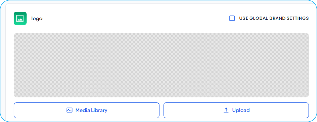
Clicking Use Global Brand Settings will give the choice of the Brand Settings defined Logo or Horizontal Logo
Clicking Media Library lets you select an existing file
Upload allows you to add a new file
Color Parameters: allows you to set a color
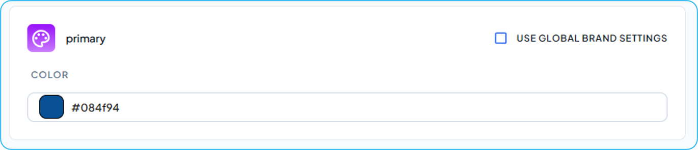
Clicking Use Global Brand Settings allows you to select one of the colors defined in the CMS Brand Settings
Click on the color sample to open the color picker, or paste a color code value
You can set a new Default Theme by clicking the Set as Default box in the upper right
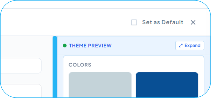
The Default theme will be the theme value that is selected first when a user edits a launchpad with the theme options
You can see a complete preview of the theme settings by clicking the Expand Preview button
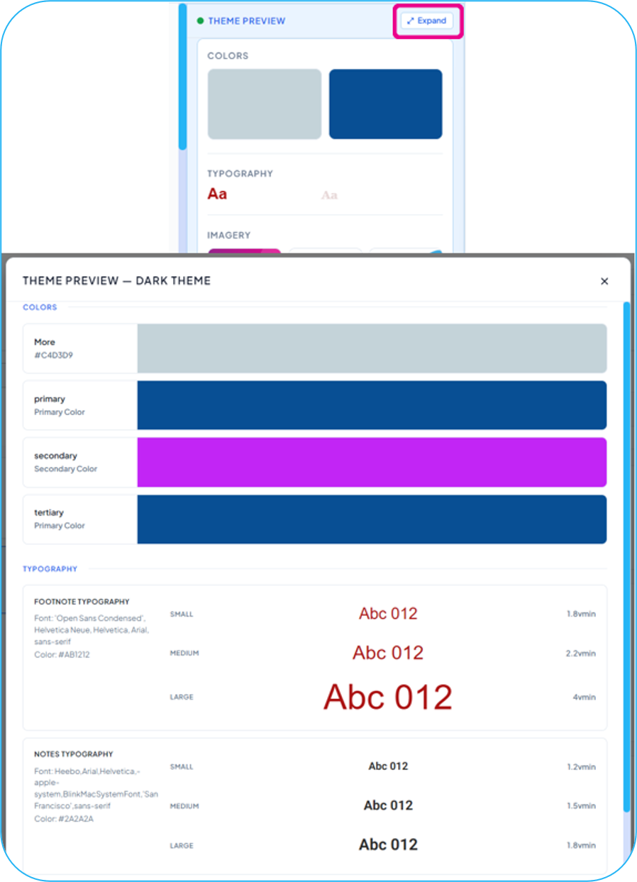
Save your Theme
The theme will now be available when using a Launchpad that is based on a Predefined Layout that has Parameters enabled.
Enabling Parameters in a Predefined Layout Template
To have Themes available, at least 1 element in the Predefined Layout has to have the Parameter option selected
The initial Launchpad designs provided by Korbyt as part of every system do not include theme options
To set an element to be templated to a parameter
In the Layout Builder for a Predefined Layout
Open the Element’s Properties menu, then select the Attributes tab
Label your Element with a name
Select Templated
Select Parameter
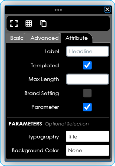
Depending on the Element Type, different parameter options will show
Typography Parameters
Allows you to select one of your Global Text Parameters
The user will then be able to make selections based on the theme they select
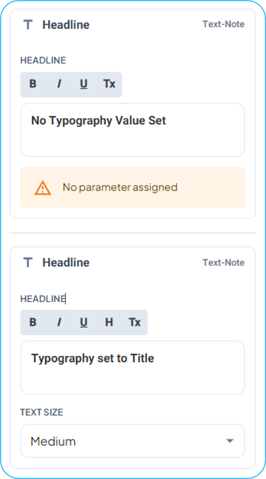
If you leave Typography type as None, the Font and Size will be set by your initial placeholder value in the Predefined Layout.
Below, you can see the result in the Launchpad of setting the Typography versus not setting one
a
Background Color
Sets the element’s entire background to a color parameter that is defined by the theme
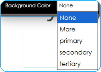
None leaves the element with a clear background
Image
Sets an image into an element based on the Parameter and Theme
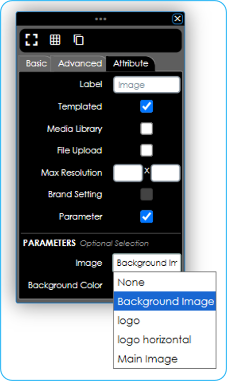
Setting only templated, Parameter, and an Image Parameter value will then have the image in the element change only based on the theme choice the user makes
Selecting Media Library and/or File Upload will add the option for the user to change the image in the container beyond the initial value set by the theme
For more information on building a Predefined Layout, see:
Using a Launchpad with Themes
When a Launchpad is based on a Predefined Layout with at least 1 element set to Parameter, the top of the Launchpad editor will have a Theme Selection dropdown
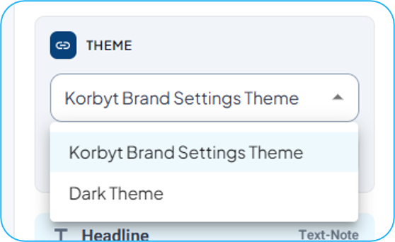
Changing the dropdown will set all the Elements with parameters to the values defined by the theme
For example, a Launchpad can switch between Background Image and Font color choices driven by the Theme.
For themes to be available in a Launchpad, the base predefined layout has to have at least one element that is set to Parameter (see above)
Was this helpful?
Still need help? Share an idea